Building ExpTracker: A Budget Dashboard That Matches How I Actually Spend
2026-09-30
Every spreadsheet budget I’ve built has died the same way: fine for the first two weeks, abandoned by the third, because logging a transaction took longer than the transaction itself. ExpTracker is my attempt to fix that — a small web app that tracks income and expenses against a custom period, not just a calendar month.
Why periods instead of calendar months
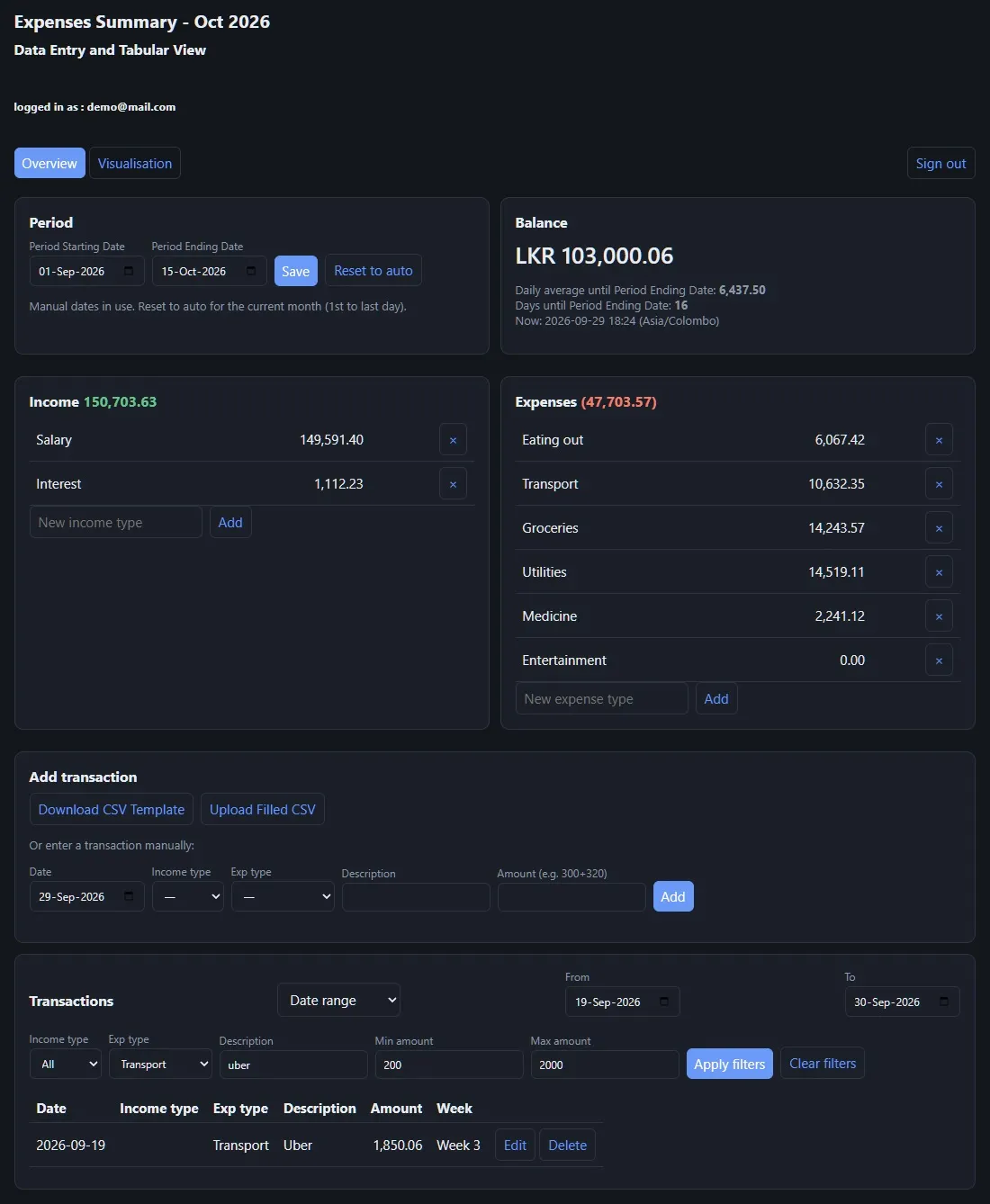
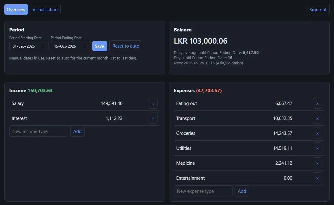
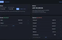
Pay cycles rarely line up with the 1st to the 30th. ExpTracker lets me set a Period Starting Date and Period Ending Date manually, or reset to “auto” for the current calendar month when I don’t care. Everything downstream — the balance, the daily average, the days remaining — recalculates against that custom window instead of assuming a tidy month.
The Balance card does the one piece of mental math I actually want done for me: daily average remaining, and days left in the period, both against the live clock in my own timezone.
Getting data in without it becoming a chore
This is where most budget trackers lose me. ExpTracker has three ways in:
- Manual entry — pick a date, category, description, and amount. The amount field quietly accepts arithmetic (
300+320), which sounds trivial until you’re splitting a bill and don’t want to reach for a calculator first. - CSV bulk upload — download a template, fill it in offline (useful after a trip, when I’ve got a week of receipts to log at once), and upload it back.
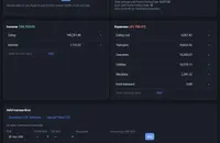
- Categories you define — income and expense types aren’t fixed; I added “Interest” and “Entertainment” myself from the same panel where I review balances, instead of digging into a settings page.
Finding one transaction in a few hundred
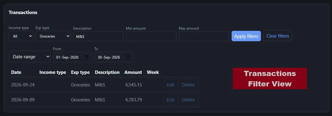
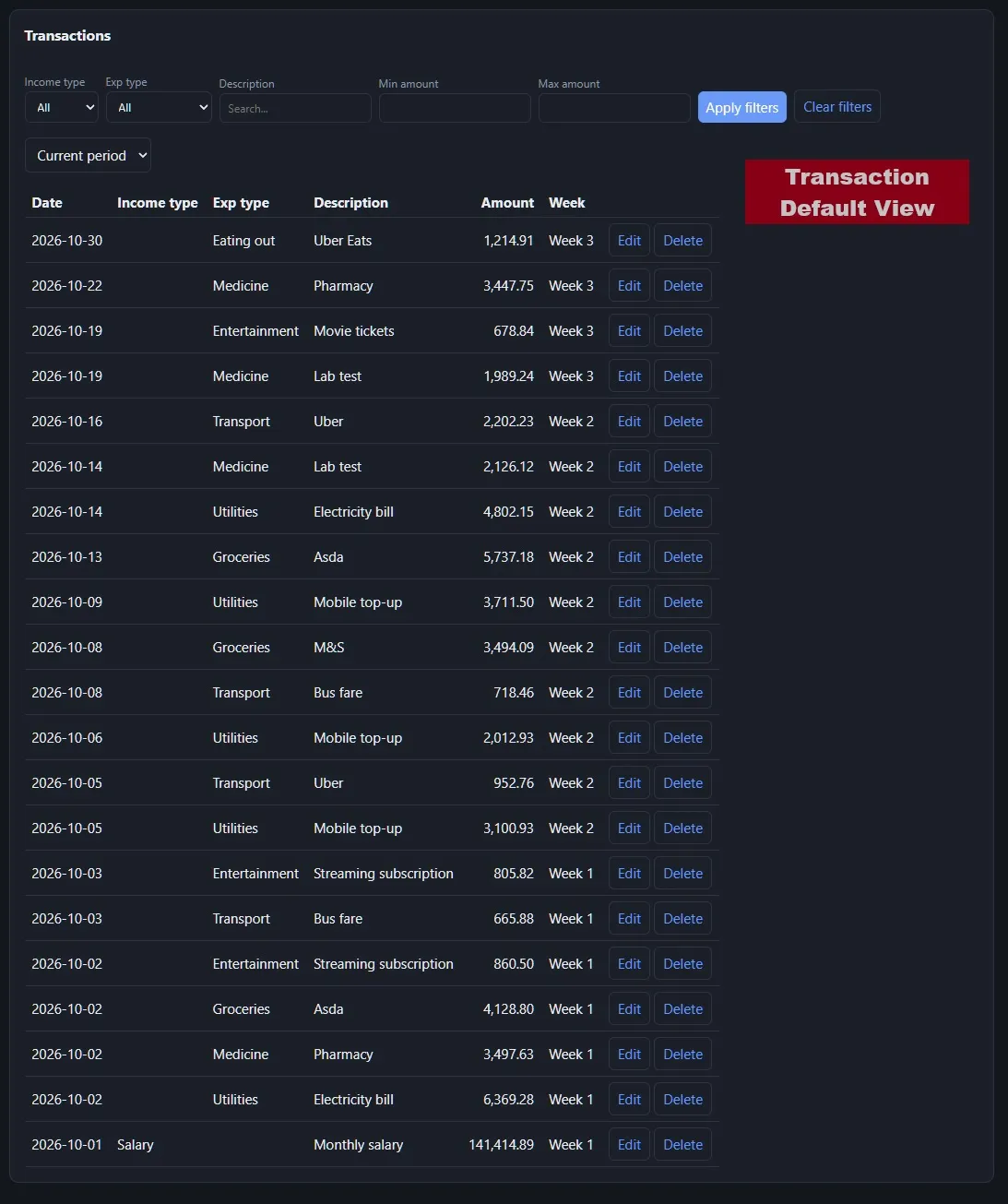
The transactions table filters on income type, expense type, a free-text description search, min/max amount, and either a date range or a quick “current period” toggle. Searching “M&S” with the Groceries filter applied finds exactly the two transactions that match — which matters once you’ve got a few months of data and are trying to answer “how much am I actually spending at M&S,” not just “show me everything.”
Making the numbers mean something
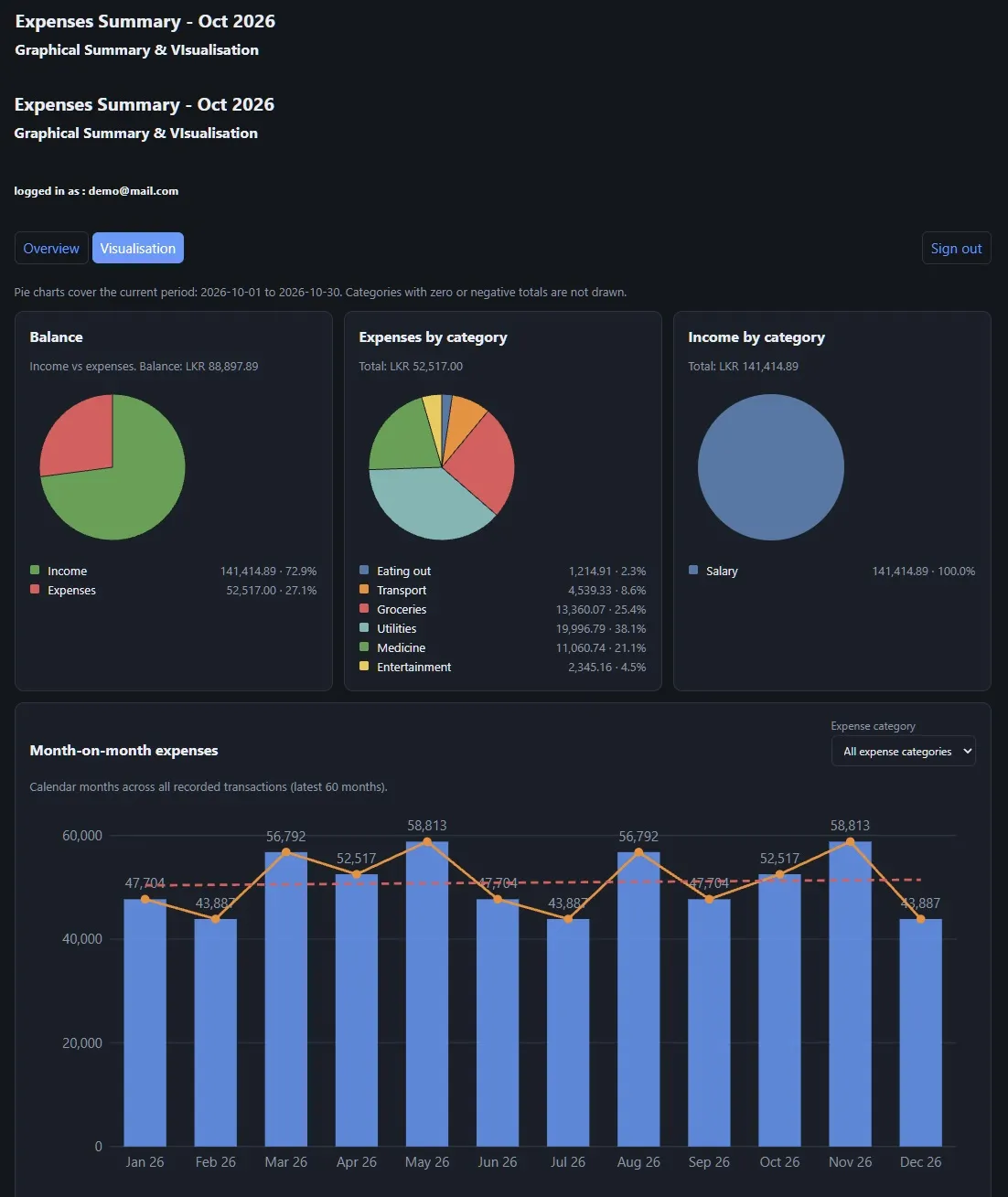
The Overview tab is for entry and bookkeeping. The Visualisation tab is where I actually learn something: income vs. expenses as a balance pie, an expense breakdown by category, and a month-on-month bar chart with a dashed average line so a spike is visually obvious instead of something I’d only notice by scanning a table. A category filter on that chart lets me isolate, say, just Medicine spend across months without losing the rest of the context.
What I’d still change
The categories are flat right now — no sub-categories, no tags. For personal use that’s been fine, but if I ever wanted to track, say, “Transport → Uber” separately from “Transport → Fuel,” I’d need to add a layer I’ve deliberately left out so far. Simplicity was the point; I’m not adding it back until the flat version actually stops working for me.
Gallery
.BGrKh3f7_7M0j3.webp)
.BGrKh3f7_Z5Lrqu.webp)